Saturday, December 4, 2010

Paula Scher


Paula Scher is known as a designer of corporate identities, posters, environmental graphics, packaging, magazines and public spaces. Beside that she is also famous for her paintings of maps rich in information. She fills up her maps with words,presenting the surroundings in a visual way.
" From a distance they resemble patchwork quilts; up close their details are at once clinical and revealing," Coggins says.Scher studied at the Tyler School of Art in Philadelphia.She co-founded Koppel & Scher in New York, than later joined Pentagram.


A hater of the font Helvetica, she mostly used different fonts in her design, which led to her rather "retro" design style, influenced by historical design.
"She is an accomplished graphic designer, and while the work is full of aesthetic pleasure, it's not overly wrought."(Coggins)


She worked with clients like: The New York Times Magazine, The American Museum of Natural History, the Brooklyn Museum of art, Anne Klein, Citigroup, Metropolis, Phillips Van Heusen and New York Botanical Garden. She also served as a teacher at the school of Visual Arts. Scher won several awards and was named to The Art directors Club Hall of Fame.

"Scher is a fantastic voyager who intuitively grasps that when great distances are covered, it's best to tread lightly." David Coggins


Coggins, David. "Paula Scher at Maya Stendhal." Art in America 94.4 (2006): 156. OmniFile Full Text Mega. Web. 4 Dec. 2010.http://www.mayastendhalgallery.com/repetitions_bios_pscher.html

Thursday, December 2, 2010

Hermann Zapf


Born in Nuremberg in 1918, Herman Zapf during his school years was interested in technical subjects. Started his career as a photo retoucher than later lettering retoucher. From Nuremberg he moves to Frankfurt, where he spends most of his time in typography and song book writing. During this time, Zapf's developed heart problem resulted in loosing his position. after the war broke out, he joint the army. Due to his incapability, his career in the artillery ended shortly. he found happiness working in the cartography, drawing maps for Spain. after the war, Zapf turned back to Nuremberg where he gave some lessons. In 1947, however, a position in a printshop was offered, so he moves back to Frankfurt. Zapf is responsible for developing different printing types like: Palatino, Antigua and Optima. Zapf claims that he witnessed all stages of type procedures and he was also working on using typography in computer programs.


In 1977 he founded "Design Processing International Inc., which later become "Zapf Burns & Company." Unfortunately the company did not last for a long period of time. Developing the type Zapfino took a long time and effort, but finally Lynotype helped with the finishing.
"I did it especially to offer something more useful, compared to the many bad alphabets pushed on the market by designers in the last [few] years, who have no idea at all about good forms of calligraphy,"Zapf said about the Zapfino.
Zapf work resulted in more than 200 typefaces known today. The most popular types are: Palatino, Optima, ITC Zapf Chancery Italic, Michelangelo, Zapf International and Zapf Renaissance.

"In spite of mechanization and rationalization, it will be our task as book artists and alphabet designers, together with the technicians, to maintain the artistic aspects for progress in the evolution of printing"(Hermann Zapf).


Shaw, P. Zapfino. Print (New York, N.Y.) v. 53 no. 5 (September/October 1999) p. 68+
http://download.linotype.com/free/howtouse/ZapfBiography.pdf
http://www.identifont.com/show?14C

Wednesday, December 1, 2010

Type History

The birthplace of type and print is believed to be Asia. First prints were found in Chinese temples. Gutenberg introduced the printing in Europe in the late 1440s. The Renaissance is the age when fonts start to develop. Before Gutenberg the only fonts known were Old English, Gothic and blackletter but the Renaissance gave birth to other font known as new Roman.There was also a transitional age where old style met modern style and the font created is known as Times Roman.
The following age was the Modern era when the sans serif typefaces like the Egyptian were born. But of course, not all modern typefaces are sans serif. Other fonts from this period are known as New Century Schoolbook, Futura and Helvetica.
Today, great variety of typefaces are available through the digital world. the most well-known fonts used are: Arial, Times, Helvetica, Courier and Symbol. Some of the most famous type designers are: Adrian Frutiger, Aldus Manutius, Claude Garamond, Eric Gill, Frederic Goudy, Giambattista Bodoni, Herman Zapf, Jan Tschichold, John Baskerville, Nicholas Jenson, William Caslon, and William Caxton.
Below I posted three videos related to type. The artists used type to create art, digital image.

http://www.pbs.org/independentlens/helvetica/type.html
http://desktoppub.about.com/od/typedesigners/Famous_Type_Designers_and_Printers.htm

A lesson on Typography

Wednesday, October 27, 2010

Neville Brody


Neville Brody is known as a graphic designer, typographer, art director and last but not least a brand strategist. In London, he went to College of Printing where he first studied graphics and typography. Brody's art is a mixture of typefaces with decorative elements. He first started by designing record covers and labels and then he works for several magazines. Some of his clients we can mention are City Limits, Dutch Postal Services, and German Cable Channel Premier. Brody is a also a font designer and he is responsible for typefaces such as Arcadia, Insignia, FF Blur, FF Gothic, FF Harlem and so on.
Brody along with Jon Wozencroft have founded Fuse, a digital typography magazine. Their goal through the magazine was experimentation. Brody also renamed his studio to Research studio and created Research Arts and Research Publishing.
In an interview with the designer, he reveals what research really means to him and his company; research is an analysis of structure and meaning. Brody also compares design to jazz music, both have to have a strong foundation before you can improvise. His art is structural. He combines science and art and creates in a modernist style.
Today Brody still works for his company creating visual language for publishing and motion picture but also does packaging and website design.


Heller, Steven. "Back talk: Neville Brody, graphic designer, type designer." Print (New York, N.Y.) 53.2 (1999): 36. Art Full Text. Web. 27 Oct. 2010.
Brody Goes Home." Creative Review 25.9 (2005): 19-20. Art Full Text. Web. 27 Oct. 2010
http://www.identifont.com/show?16X
http://www.art-directory.info/design/neville-brody-1957/index.shtml


Tuesday, October 26, 2010

Wim Crouwel


Crouwel is a remarkable, inspiring figure born in Netherlands and influenced by the Bauhaus. His art is mostly focusing on typography but he is also known as an expressionist painter. Crouwel's systematic approach and the ability to integrate both emotional and rational in his work brought him to the top of his game. He designs print works;catalogs and posters, postage stamps, phone books and also fonts. Very attracted to the neutral typefaces, Crouwel believes that the type should not have meaning in itself but to inform and inform quickly and clearly. He further states that text should be readable but still aesthetic.
"I am a modernist, you know, I was trained in the period. I lived in the period. I love modernism". (Wim Crouwel, Helvetica)
Crouwel is also well-known for his ability to carefully listen to the clients and incorporate their wishes in his work properly.


If you are already not familiar with his work, probably one of the most well-known font jobs done by Crouwel is the "New Alphabet", digital typesetting.
In one of the interviews with Crouwl, he gets the chance to talk about the debate that went on for almost a decade between two designers, Crouwel himself and Jan Van Toorn. The differences in design views between the two designers became very clear and soon became a debate. While Crouwel's work was clear, harmonious, using single typeface and almost uniform, Toorn dared to be messier and each new work different from the previous. Crouwel angered by Toorn's work, their relationship was confrontational for over a decade, but fortunately today they are in good terms. While Crouwel does not like to use many typefaces and believes that should be kept neutral and also informative, today his work is considered maybe simple but trendy.

"The meaning is in the content of the text and not in the typeface, and that is why we loved Helvetica very much". (Wim Crouwel, Helvetica)


Complete Crouwel [type face designer Wim Crouwel]. Creative Review v. 17 (May 1997) p. 88
Poynor, R. Counter points. Print (New York, N.Y.) v. 62 no. 4 (August 2008) p. 31-2
http://www.iconofgraphics.com/Wim-Crouwel/


David Carson

1. Milton Glaser
2. Paul Rand
3. Saul Bass
4. Massimo Vignelli
5. David Carson
6. Stefan Sagmeister
7. Herb Lubalin
8 Tibor Kalman
9. Paula Scher
10.Margo Chase


According to the Graphic Design USA magazine, David Carson is one of the top most influential graphic designers of the era. He is considered the "Billy Idol of the graphic design" and a "popularizer." (Steven Heller)
Words mixed together in an odd way, overlapping each other with a mix of lower case and capitalized letters and sometimes blurred perfectly describe Carson's style. With little or no education in the design area, David Carson recognized what the audience was looking for and rapidly moved up among the greatest designers of the age.
At the age of 24, he was designing two surfer magazines, being a surfer himself. He soon got involved with bigger companies. The goal of his work was not legibility but communication.


Carson believes that people today do not like, or have no time to read so he creates the images with the words that speak as an art form. As we learned this week in class,the media and advertising companies are greatly influenced by the teenage population, the biggest consumers on the market. Carson recognized the need and responded two this generation in a way that really worked. Beside the prints, the designer also works with moving images and finds them more interesting. Carson has his own studios in New York and Virgin Islands and some of his clients are Quicksilver, Nike, Nine Inch Nails and Neutrogena.


Even though well known and well respected by some, he was considered a designer who is doing everything wrong and was not accepted by design communities. The fact that Carson believes in making beautiful art by questioning all the rules, pissed off lots of educated designers. But, he moves to Charleston, and he disappears from the big city and also from the main stage. And as a result to all the criticism, he writes a 460 page book about his work, and also a "fuck you to the industry," according to Burgoyne Patrick, Creative Review. And while some people are criticizing Carson indeed, others believe he plays an important role in the world of graphic design(Alexander Gelman).

"He converted an abstract, somewhat dry area into something a little sexy. Briefly."
(Lewis Blackwell, former editor of Creative Review)


Newsweek, February 26, 1996 , UNITED STATES EDITION, THE ARTS; Design; Pg. 64, 1067 words, BY PETER PLAGENS AND RAY SAWHILL
Burgoyne, Patrick. "Where is David Carson?." Creative Review 24.4 (2004): 46-9. Art Full Text. Web. 26 Oct. 2010.
Folio: the Magazine for Magazine Management 24.n4 (March 1, 1995): pp50(4). (1981 words)
http://www.davidcarsondesign.com/

Stefan Sagmeister


Stefan Sagmeister is far one of my favorite graphic designers. His design is innovative, very original and nature inspired. He dares to bring something new in the design world, something different from all the today's computer-based art work.
He attended school in Vienna, at the University for Applied Arts. Even though never interested in drawing, he believes that the studies of nature offered at the school helped him developing his talent and style that he has today. One of the few people interested in graphics among his colleagues, Sagmeister decides to apply for a scholarship offered by the Vienna's theater director, Hans Gratzer.He did not know at that time, but Gratzer familiar with Sagmeister's work, gave the scholarship to him and so the opportunity for him to study in New York for a few years. Great opportunity for Sagmeister. The following years he travels back to Austria and than to Hong Kong. While some of us believe that he already showed his talent to the world, he believes that he was just lucky and that everything just fell in his lap while he was doing 0, the designer states. When he finally comes back to New York, he starts working with the Hungarian graphic designer Tibor Kalman. Today Sagmeister runs his own business and he is among the most talented and well-known designer. He is mostly known for his CD cover designs, poster designs but also for his books.Evan though very successful and busy with clients, Sagmeister decides to leave, escape for a period to clean up his thoughts since his work "becomes repetitive." You would thing that he would have angry clients, who are left behind but on the contrary, Sagmeister is being supported and does not loose any clients. He has other interesting methods mentioned in an interview; every Thursday morning from 9-12 he does a complete CD cover design and he calls it experimental. After that he schedules a period of "free thinking". The afternoons are filled with reading and other relaxing activities. The designer further states in the interview, that a secret to good design is to keep your old sketchbook and go over it and look for ideas that maybe did "not work for the past but might work for the future."
A great, interesting personality with an even greater talent, Sagmeister is one of the leading designers in New York.
"Everybody who's honest is interesting",Stefan Sagmeister.


A conversation with Stefan Sagmeister and Lou Reed: Take a Walk on the Wild Side
Anonymous. Graphis. New York:May/Jun 2002. Vol. 58, Iss. 339, p. 124-135 (12 pp.)
http://designmuseum.org/design/stefan-sagmeister
http://www.designboom.com/eng/interview/sagmeister.html
http://www.ted.com/talks/stefan_sagmeister_shares_happy_design.html

Wednesday, September 29, 2010

PIXNIT Post III


[Since today we have learned about Art Nouveau, I thought I write my blog about PIXNIT, whos ornamental, flowery style, linked to the decorative arts, reminds me very much of the Art Nouveau style]

"As we get farther from her work, we're going to recognize that she's a different voice in contemporary art."(Chris Constas)

Pixnit was a street artist, who introduced something contemporary by combining graffiti with something traditional. Her style is beautiful, elegant. Her technique is spray paint and ornamental stencils, also called "spores." The artist has been influenced by Mexican mural art according to Asher. Her art is also influenced by the decorative arts, 17th-19th century architectural ornaments and wallpaper.(Folie que la nouveaute,2008).

The name PIXNIT comes from latin, which means "she painted it."
She is believed to be a rare artist, with a wonderful personality, who brought beautiful contemporary art with a hint of tradition and who believed that everyone deserves to enjoy art and art should be visible, easily accessible.
Unfortunately, she will not continue her journey since she is believed to be dead after dissapearing on April 2nd during her visit to Paris, but she will not be forgotten since her work has been exhibited in many places, such as Boston, Los Angeles and also in Switzerland.

"This quarreling over graffiti is going to fade, and she will be recognized as a great American artist", Constas believes. She is not limited to street art, she also works on canvas and paper, but she is recognized as a graffiti artist since 1987. (Gallery revisited)

http://pixnitproductions.com/Info.html
http://www.decordova.org/decordova/exhibit/2008/PIXNIT.htm
http://www.weeklydig.com/arts-entertainment/visual-arts/200804/pixnit

Thursday, September 23, 2010

Franco-Belgian Comics Post II


European comic art is considered to have richness in style, humor and realism. Comic art was famous and respected all around Europe, especially in France and Belgium.
I would like to concentrate on the Franco-Belgian comics( so called because they were created in France and Belgium),but especially on the ones with the middle eastern influence. The Franco-Belgian art was heavily influenced by the middle eastern civilization. probably one of the earliest and most famous graphic novels is "The Adventure of Tintin," by the belgian comic artists Herge and George Remi. Herge created his own studio and started working with other comic artists such as Jaques Martin, who got the chance to become known and famous by creating "Alix" hero, in a Persian word of a different time.
Gilles Chaillet follows them who is known to be the master of middle eastern comics. the Persian culture has a major impact on his art and he creates "Vasco," a medieval knight of the Middle Ages. His adventures are taking place at the time when Persia and the Byzantine Empire were rivals.
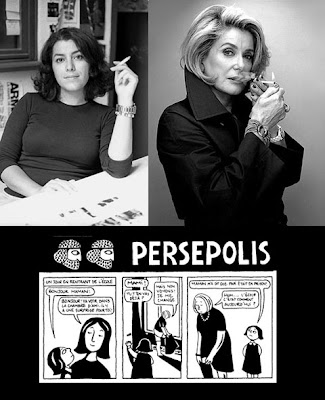
Marjane Satrapy also a member of the artists interested in the middle eastern culture, successfully completes the circle of artist with her series "Persepolis." The hero in her graphic novel is not a muscular, strong figure but a school girl, who experiences the Pre and Post Revolution in Iran. The style of these comics are known as a clean line style. The reason I talk about the European comic art is because I wanted to see what differences in style and plots can be found on different parts of the world and how American artist were influenced by them.

Body Graffiti Post I


Body art, and more precisely tattoo, has been present since centuries and served not only as decorative art but also as identification, branding and in some cultures had spiritual meaning,and also represented ranks of status.
Tattoo art is believed to be practiced as early as the Neolithic times in Eurasia and than spread out to the whole world. Different cultures had different believes and traditions, so the body art was used differently. A very good example of tattoos with cultural and sacred association are the Ta Moko tattoos, that are closely related to the Maori people from New Zealand. The designs of these tattoos represented their lives as these few lines are also telling us;
"I wear my pride upon my skin
my pride has always been within
I wear my strength upon my face
comes from another time and place
Bet you didn't know that every line has a message for me?
Did you know that?" (Awekotuku & Nikora, 149)
While the use of tattoos usually has a positive impact;for example, in some cultures is practiced to heal just like acupuncture,it's not always the case. These body sign can represent a group of people with same believes, just like the Nazi, or other criminal groups. These people use it as a sign to identify and to become part of the specific organization. Body art embraces a huge diversity of people, while it is celebrated as an art form by holding exhibition of painted bodies, prisoners also ink their skin to symbolize their criminal behavior.
Tattoo artists confess that half of the population has one or more tattoos, and some of them have it to represent beauty while others to create fear. Either way is a symbol, an art for expressing yourself.
In today's world, this form of art expanded in the medical field as well. In cosmetics use it as permanent makeup or changing skin tones in some areas.
I chose this topic because I believe there is a connection of some sort between the body art and graffiti. The artist introduced a new form of canvas, that of the human skin.

Te Awekotuku, Ngahuia , and Linda Waimarie Nikora. Mau Moko; The World of Maori Tattoo. Honolulu: University of Hawaii, 2007. 148